Tuesday, February 1, 2011

Digitizing Iraq-1999


I had some trouble with being able to clearly separate the province and city names. ArcMap continued to give me an error message about the map units. Overseeing this minor detail however, the digitizing was relatively easy and straight forward. I liked having to figure out some of the operations by just experimenting and some by getting help from classmates. I had trouble with the function of cutting the polygon which was necessary to make the provinces; I had overlooked the fact that my overall tracing of the Iraq map had to be selected in order to do proper snapping. I believe this lab was very instructive and that it is also very useful in common practice.

Tuesday, January 25, 2011

Lab 3-Geocoding Elementary Schools


I chose to geocode the locations of elementary schools in two different counties in the state of California. These are the Fresno and Merced counties in the central valley. This map can be a useful resource for families who have children going to an elementary school in these counties. These elementary schools are of two types, although no distinction is made in the map itself; some fall into the category of kindergarten through sixth grade and the others into the category of kindergarten through fifth grade.

Parents can use my map as a resource to decide which elementary school their children will attend. My map provides location information on these elementary schools. This is useful information for determining the distance between schools and homes. Then, parents can compare how far children will travel to and from school, and what method of transportation they will need. Parents can ask and answer questions such as: can I drop my child off at school? Does my child need public or school transportation? Can my child walk to school? Furthermore, the information in my map can be useful to families already living in the counties of Fresno and Merced, as well as to families arriving to these counties.

In the process of geocoding, there are multiple steps which I followed to arrive at the final map. Before displaying any data through ArcMap and using an address locator, it was important to have the right amount and format of data. At first, I struggled with this first part of the process. As I looked through different possible locations to geocode, I realized that I needed addresses, cities, states, and zip codes for each location. Having this information allowed an accurate assessment of the address locator in matching addresses. I entered the data for each elementary school into an excel spreadsheet; this process was tedious, but getting it right prevented mistakes in the following steps on ArcMap. I also needed a shapefile of the streets of California to display the locations appropriately.

Once on ArcMap, I added the elementary school data on the excel spreadsheet. I also added the streets shapefile. Finally, I used an address locator to match the elementary school locations and display them on the streets. I added the address locator through ArcCatalog. The locations of the elementary schools are concentrated mainly in two areas, which correspond to the counties of Fresno and Merced. I geocoded the elementary schools in these two counties to provide information mainly to parents, but this information can also be used by school districts in matters of construction of new schools, or transportation systems for students.

Saturday, January 15, 2011

Tuesday, January 11, 2011

Tuesday, December 7, 2010

Final Lab-Census 2000


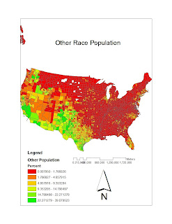
My first map, is titled “Other Race Population” because it shows county level race data for some other race alone, against the continental United States, and ranked by percent. I retrieved the necessary data from the U.S. Census website www.census.gov. The color scheme which I chose for this map is explained by the legend at the lower left corner of the map; it contains six classes. The color scheme highlights the population percent distribution and makes for very distinct areas on the map; this creates a map which is easily read and searched for specific information about population. In the northeastern direction, the population percentages for this race are low; these increase in the southwestern part of the country. The scale bar and north arrow provide information for measurements and orientation respectively.

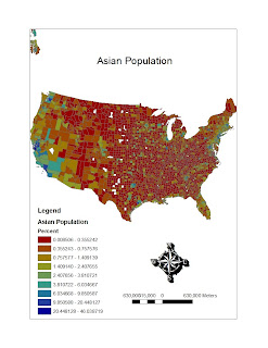
My second map is titled “Asian Population”, it shows county level race data, ranked by percent for the Asian population against the continental United States. This data I also retrieved from www.census.gov and it is for the year 2000. For this color scheme, I used nine classes in order to see the percentages in a more broken up format. The distribution of the Asian population appears to be scattered around continental United Sates, and there is no clear cut distinction between one part of the country and another. Once again, the north arrow provides direction, and the scale bar a basis for measurement.

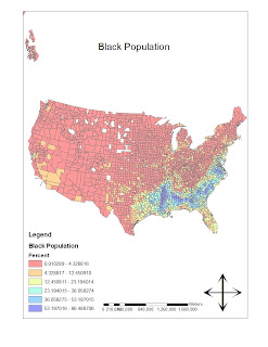
My third, and last map, is titled “Black Population”. The information in this map consists of country level race data, percentage ranked across the United States. I retrieved the data from www.census.gov in the form of an excel document, and it is census 2000 data. In this map, I went back to using six classes for the color scheme. This map, like the first one, emphasizes clearly, where the black population is located in the United States. In, this case, the Black population is concentrated in the southeastern part of the country. The north arrow and the scale bar help in navigation about the map.

The census provided detailed excel documents about each population percentage distribution across the United States. In order to use these data files in Arc Map, it was necessary to modify the contents of the excel documents; I removed the headings above the actual data so that it would be possible to join this data to the counties layer. It was also important to give the excel files a title without spaces so that Arc Map would be able to recognize them.

I have really enjoyed and also hated my experience with GIS. Overall, it is an experience which I have extracted much knowledge from and I am always interested in the different tricks and tools I can use to complete my labs. But, when I am stuck on a step in the process, I become very frustrated and feel like I don't know anything. I enjoy very much however, figuring out the steps which have stopped my progress on my own. It is gratifying to learn from other classmates as well, but when I figure it out on my own, I love it. I feel that GIS gives skills which can be used for a specific field, which is mapping, but it also allows me to work on a huge range of topics (with GIS, I can map pretty much anything). In using GIS, there are no limits to discovering and working in any field. I enjoyed GIS and I would like to continue to intermediate, I hope I can survive.

Wednesday, November 10, 2010

Lab #6 DEM


I chose to acquire a DEM from a region of the Yosemite National Park. I had a difficult time finding this region from just looking at the map on the website, however there was a tab which added the counties to the map and I was able to find the park. The process of downloading the map was very practical and easy to do.
The different overlays which I projected the map in were hillshade, slope, and aspect. The DEM layer was set above these other layers in the ArcMap table of contents in order to see the information portrayed on the DEM layer. I picked different color schemes to best suit the information displayed.
Finally there was a 3D map to be made. The DEM had to be in ArcScene in order for this 3D map to be made. When recently inputting the information into ArcScene, I could not find my 3D image, the screen was blank. The problem was solved by adjusting the value for the "Z unit conversion factor" to a .0001 value.
There were more toolbars to be used for this DEM lab which allowed the viewing of the DEM in multiple ways. It was necessary to keep track of which toolbars to use and when to use them. This lab was interesting, especially when working with a 3D visual in ArcScene.

Lab #5 Map Projections

Original Map


Conformal Projections
Mercator


Gall Stereographic


Equal Area Projections
Sinusoidal


Bonne


Equal Area Projections
Equidistant Conic


Aitoff (Equatorial Azimuthal)


The map projections which I chose belong to three different categories which are conformal, equal area, and equidistant. For the conformal map projections I chose Mercator and Gall Stereographic; for the equal area category, I chose Sinusoidal and Bonne; the equidistant map projections were Equidistant Conic and Aitoff. To understand and analyze how the different map projections change the perception of the world map, distance in miles was taken for all map projections between the cities of Kabul and Washington D.C. across the Atlantic ocean; the distances are as follows: Mercator-10,163 mi, Gall Stereographic-7,167 mi, Sinusoidal-8,094 mi, Bonne-6,779 mi, Equidistant Conic-6,992, and Aitoff-8,649 mi.

It is important to understand the characteristics of each type of map projection to have a better understanding of how the world is perceived on each map. Conformal map projections have parallels and meridians which intersect at right angles; this can be observed from the Gall stereographic map. However the most important characteristic of a conformal map projection is that map scale is preserved across the map; meaning that shape and angles are preserved. In equidistant map projections, the distance from the center of the map is equal in all directions; this is clearly observed in the equidistant conic map. Lastly, in equal area projections, areas on the map maintain the same proportional relationship.

Because variation in the distance measurements from Kabul to Washington D.C. are noticed in all six map projections, it is important to understand what each map will be used for. A clear understanding of the purpose the specific map in terms of what information it provides, makes it easier to choose a map and understand why a given measurement is what it is. Also, the person analyzing a specific map projection might benefit more from an equidistant map projection if his study needs a map with the qualities of this type of projection.

Questions answered about the general map were measurements of the span of the equator-360 degrees. From northern to southern-most graticule the measurement is 180 degrees.