Tuesday, February 15, 2011

Landfill Suitability Analysis Factors-Lab # 5


Analyzing landfill suitability in terms of streams, elevation, cover class, soil drainage, and distance to landfills is very important and useful. These analysis provide information about specific identities in a place (such as Gallatin County in this project), so as to attain a prioritized suitability for landfills; for example, if the priority is determining where to put landfills based on cover class, the map of this category is used. These types of decisions are centered around the effects on humans, as seen in the Sahagun article, therefore it is important to note how each category analyzed affects humans as well.

Continuing with the cover class category, it is also possible within the category to make distinctions between places which could potentially sustain landfills and those which can not. When reclassifying the cover class category, I listed the cover classes of water and cropland as completely unsuitable (entering NoData in their fields); because landfills possibly represent danger in terms of toxicity and birth defects, they should by no means be found in these cover classes. Areas of water and cropland are of the most important resources needed by humans, therefore these should be most taken care of so as to avoid their contamination (which would lead to negative impacts on humans).

Knowing what kinds of toxic elements may be present in landfills as well as at what proximity they represent a danger to humans is also very important. In this case, we can put emphasis on the category of distance to landfills. By using this analysis, we can interpret the distance to landfills in terms of lethality for humans; how close to a toxic element is too close? At what proximity can PCB's (a cancer causing element mentioned by Sahagun) affect humans? We can also think about runoff of toxins from landfills to streams as a problem. If landfills are too close to streams, their contents may be carried off to the water; we see that the stream buffers category helps us analyze what the right distance of landfills from streams can be.

In similar forms, the soil drainage and slope of elevation categories help display how toxins can be carried off to places where they would have a negative impact on humans. The final analysis category, allows an investigation of all categories displayed in one map. It is important to analyze all of the categories together in order to account for overlaps; perhaps, places which are definitely not suitable can be more easily differentiated. This kind of analysis may also lead to the discovery of places in which it is reasonable to place landfills.

Therefore we see the importance of making educated and cautious decisions about the placement as well as the expansion of landfills. In Sahagun's article, expansion of a landfill in the Central valley is detained until further tests determine whether or not this creates a negative impact on humans. Because water is so necessary for human survival, efforts to clean already contaminated water are also being considered by environmental agencies.

Wednesday, February 2, 2011

Quiz # 1- L.A. City Schools and Medical Marijuana Dispensaries


I am in favor of the decision made by the L.A. City Council which requires medical marijuana dispensaries to be at least one thousand feet from places where children congregate. I think it is most important to evaluate this decision in terms of Los Angeles city schools; schools is where children spend majority of their time. Not only is it important that children spend much of their time at their respective school, also this is where their learning foundation is based. Therefore, I made my decision based on the perspective that schools are the pillar of growth for children and this should in no way be disturbed. However, I would like to point out that there can be other perspectives from which to view this issue which can result in a different verdict from mine.

It is important to provide voters with information such as is provided in my map, so that informed voting can take place. Therefore, it is also important to provide accurate data. I would like to point out that the main concentration is on the selected Los Angeles city. My map shows buffers of 1,000 feet around each and every school in the city of Los Angeles. I also geocoded the addresses for the medical marijuana dispensaries within Los Angeles. The purpose of this data display is to see where these dispensaries cross into the buffer zone (which means they would be violating the decision made by the Los Angeles City Council). At least half of the dispensaries cross into the buffer zones for different schools. This should not be the case if children and their environment is to be protected and respected.


Implementing this decision does imply the shutting down of those dispensaries which cross into the buffer zones; this results in costs of closure and, probably also affects the owners of the dispensaries. Even though there may be difficulties, it is important to measure the value of each side of the conflict. Is it more valuable to shelter children from the activities of dispensaries so as to not disrupt their developmental stage? Or is it more important to avoid the costs I previously mentioned and let the dispensaries keep earning their profit? I believe the priority lies within how the children are affected at all times; which is why I reiterate that I am in favor of the Los Angeles City Council decision.

Tuesday, February 1, 2011

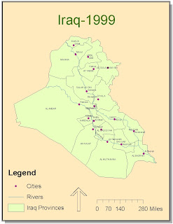
Digitizing Iraq-1999


I had some trouble with being able to clearly separate the province and city names. ArcMap continued to give me an error message about the map units. Overseeing this minor detail however, the digitizing was relatively easy and straight forward. I liked having to figure out some of the operations by just experimenting and some by getting help from classmates. I had trouble with the function of cutting the polygon which was necessary to make the provinces; I had overlooked the fact that my overall tracing of the Iraq map had to be selected in order to do proper snapping. I believe this lab was very instructive and that it is also very useful in common practice.

Tuesday, January 25, 2011

Lab 3-Geocoding Elementary Schools


I chose to geocode the locations of elementary schools in two different counties in the state of California. These are the Fresno and Merced counties in the central valley. This map can be a useful resource for families who have children going to an elementary school in these counties. These elementary schools are of two types, although no distinction is made in the map itself; some fall into the category of kindergarten through sixth grade and the others into the category of kindergarten through fifth grade.

Parents can use my map as a resource to decide which elementary school their children will attend. My map provides location information on these elementary schools. This is useful information for determining the distance between schools and homes. Then, parents can compare how far children will travel to and from school, and what method of transportation they will need. Parents can ask and answer questions such as: can I drop my child off at school? Does my child need public or school transportation? Can my child walk to school? Furthermore, the information in my map can be useful to families already living in the counties of Fresno and Merced, as well as to families arriving to these counties.

In the process of geocoding, there are multiple steps which I followed to arrive at the final map. Before displaying any data through ArcMap and using an address locator, it was important to have the right amount and format of data. At first, I struggled with this first part of the process. As I looked through different possible locations to geocode, I realized that I needed addresses, cities, states, and zip codes for each location. Having this information allowed an accurate assessment of the address locator in matching addresses. I entered the data for each elementary school into an excel spreadsheet; this process was tedious, but getting it right prevented mistakes in the following steps on ArcMap. I also needed a shapefile of the streets of California to display the locations appropriately.

Once on ArcMap, I added the elementary school data on the excel spreadsheet. I also added the streets shapefile. Finally, I used an address locator to match the elementary school locations and display them on the streets. I added the address locator through ArcCatalog. The locations of the elementary schools are concentrated mainly in two areas, which correspond to the counties of Fresno and Merced. I geocoded the elementary schools in these two counties to provide information mainly to parents, but this information can also be used by school districts in matters of construction of new schools, or transportation systems for students.

Saturday, January 15, 2011

Tuesday, January 11, 2011

Tuesday, December 7, 2010

Final Lab-Census 2000


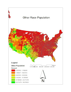
My first map, is titled “Other Race Population” because it shows county level race data for some other race alone, against the continental United States, and ranked by percent. I retrieved the necessary data from the U.S. Census website www.census.gov. The color scheme which I chose for this map is explained by the legend at the lower left corner of the map; it contains six classes. The color scheme highlights the population percent distribution and makes for very distinct areas on the map; this creates a map which is easily read and searched for specific information about population. In the northeastern direction, the population percentages for this race are low; these increase in the southwestern part of the country. The scale bar and north arrow provide information for measurements and orientation respectively.

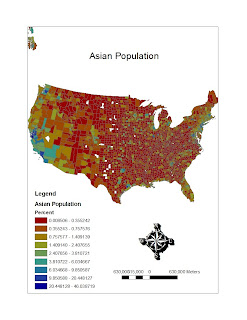
My second map is titled “Asian Population”, it shows county level race data, ranked by percent for the Asian population against the continental United States. This data I also retrieved from www.census.gov and it is for the year 2000. For this color scheme, I used nine classes in order to see the percentages in a more broken up format. The distribution of the Asian population appears to be scattered around continental United Sates, and there is no clear cut distinction between one part of the country and another. Once again, the north arrow provides direction, and the scale bar a basis for measurement.

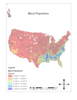
My third, and last map, is titled “Black Population”. The information in this map consists of country level race data, percentage ranked across the United States. I retrieved the data from www.census.gov in the form of an excel document, and it is census 2000 data. In this map, I went back to using six classes for the color scheme. This map, like the first one, emphasizes clearly, where the black population is located in the United States. In, this case, the Black population is concentrated in the southeastern part of the country. The north arrow and the scale bar help in navigation about the map.

The census provided detailed excel documents about each population percentage distribution across the United States. In order to use these data files in Arc Map, it was necessary to modify the contents of the excel documents; I removed the headings above the actual data so that it would be possible to join this data to the counties layer. It was also important to give the excel files a title without spaces so that Arc Map would be able to recognize them.

I have really enjoyed and also hated my experience with GIS. Overall, it is an experience which I have extracted much knowledge from and I am always interested in the different tricks and tools I can use to complete my labs. But, when I am stuck on a step in the process, I become very frustrated and feel like I don't know anything. I enjoy very much however, figuring out the steps which have stopped my progress on my own. It is gratifying to learn from other classmates as well, but when I figure it out on my own, I love it. I feel that GIS gives skills which can be used for a specific field, which is mapping, but it also allows me to work on a huge range of topics (with GIS, I can map pretty much anything). In using GIS, there are no limits to discovering and working in any field. I enjoyed GIS and I would like to continue to intermediate, I hope I can survive.